

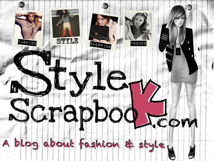
I’ve had the same banner for quite some time and thought it was time for a change.
A lot of you told me through twitter that you like my old banner, but change is good dont you think so? Even if its going to take us a while to get used to it.
I spent few hours designing this 4 banners and since you are a big part of StyleScrapbook, I wanted to put it for a vote.
Just write a comment saying the number you vote for: 1, 2, 3 or 4, it is that simple….HERE WE GO!
Traduccion:
Como ya llevaba mucho tiempo con el mismo banner, decidí hacer unos nuevos y como ustedes son una gran parte de StyleScrapbook, quise ponerlo a votación, solo tienes que dejar un comentario con el numero del banner que te gusto, y listo!
1.

2.

3.
4.

5.

SO WHICH ONE DID YOU LIKE???
Dont forget to comment with the number! :)
♥
Andy
397 Responses
4 :)
4!
love the first image
i really like 2 and 5
i prefer number 4..definitely!! :)
Number 2))it's so cute.Nastya
the two last ones
My opinion about the banner:# 1. You look like you are going to a funeral here. No way..To dark for your page. if a new visitor would see this for first impression, would never like to go further in your blog…# 2. I like this one the most, I choose this banner but with a modification: I would delete the quote: “a blog about fashion & style” And I would add a picture of you wearing a total colourfully dress or accessory. I like the idea of a banner with a real pic of you, and in this one you totally look great. But that dress is to normal and dark just for the page, I don’t mean normal about to wear it, just about to give something with more impact. Also consider a pic with a happy face of u. Take in mind that just to see you in a nice pic wearing something totally fabulous would make a very good first impression.# 3. Doesn’t have any colour. And the girl on the picture really doesn’t looks like you.# 4. I like a lot this one, but it doesn’t make much difference with what you already have now. And something difference is what you are looking for, right?. So despite this.#5. I keep my point, about that girl on the picture really doesn’t looks like you. I think all of us just agree about this. Don’t mean it in a bad way; just sorry but is not your kind of beauty. BUT here I love the idea about to add some colours….
My vote goes for NUMBER 2!!!
1
2 and 5 Girl!!!Regards from Poland, love ur blogg *
3 and 5 :DD
1 is perfect!!:)
I'm for number 2. It fits to your blog the best!
me encantaron el 2 y el 3pero estan todos bellossaludos Maru
Número 2!
2!!!!
I think you want to go to a more mature way with this banner, so for that I have to say 1.
Hi from Croatia :DNo. 2 deff
I like 2 =)
I think the second one is the best! You did a good job ;)
number 3!
5!
i think i prefer number 4,as it had the colour splash like water colour at the side and also, it was like a sketch drawing, and looked well nice. i love the others too,but the best was number 4 :)
1 or 3
ONE!
Numero 3! ;)
Numero 3! ;)
Numero 3! ;)
Nr.1 or 2 :)
number 2
Definitely 2 !
i love number 2 <3
5!
Number 2 Number 2 Number 2 Number 2 <3
Definitely 2!!!! ;)
I like nr. 1 !Just simple, but gorgeousxx from http://asianeyedgirl.blogspot.com/
1! Simple and different
1
Numero 1! Simple but makes a statement!
number 2!!! It screams perfection
I love no. 3!!
4 !! 4!!! 4!!! i love thad drawing!!
2
He!Ik vind de foto van nr 2. beter met de achtergrond van nr 4.Al zou ik bij nr 2 de .com helemaal in het rose doen want dat is typografisch stuk beter. ( Yeah, I know.. Ik studeer vormgeving, vandaar =)En ik vond 2 details leuk, die plakbandjes bij nr 1, en bij je oude banner By Andy.. Het is misschien teveel maar het zijn wel leuke details.Ik hoop dat je er iets aan hebt!X
Can't you use the picture from no.1 to replace the one in no.2? That would be the perfect banner! :D
Number 2 is my favorite!
definitely number 2! :)
Definitely 2!!!
Number 2! xoxo ♥
Number 1 or 2
I like nr. 1 best. It's simple but gorgeous.Just out of curiosity: how do you make those "collages",photoshop? or do you use something different?x Dana
Number 1 or 2. Such beautiful in that photos :)
2!!!!!!!
2 of 4
nummer 2 is het mooiste! :)
definitly 2 :) but number 1 is too good.
1 or 2!!
I would take nr. 2 or 3 <3
I love nr 1, so i say you should take number 1! (:xx
2!:)
i love #1. it's so simple but so cute!xoxo
Well, I like them all. They're not so diffrent. Maybe it's a nice idea to change your banner when the season changes. That will make a nice little difference :)
4!
my favorite is 4. i love colurs on that picture. No.1 is also really sweet! iI dont know wich one is the best aaaa :D maybe, you can change and font or colour of letters :):*
2 is definitely my fave x
Number 2
i like number 1
3 for sure, classy.
number 2 :D
No. 2 is the best!
1
Nummer: 2!!
Definietly 1 ! ;)
My top 3: 214xoxoAfroditethefashionfolio
number 4 love your blog hildur from iceland
No. 4!
my favorite: 1
1
1 is the best :)
hmm, i like number 2:)
1 :p
I love #1! You are the face of style scrapbook so show it proudly : )LOVE LOVE LOVE your blog, thank you, thank you, thank you!
2!
EL DOS! :D
1!
El 1 o el 2…sin ninguna duda. ya que me gustan más lo que que apareces tú que no un dibujo:)
I really love them all. But my favorites are 2, 4, and 5.-The Trendy Fashionistahttp://thetrendyfashionista.blogspot.com
i love nr 1 and 2. But if i really have to choose it will be no 2!
2 ! You've got lot of counting Andy :D all the best ! http://www.myowncatwalk-p.blogspot.com/site worth visiting :D
1 or 2
number one, it is much simpler but with more effect. The fence behind you gives it a rough look and I like that. Or number 4, the drawing is great. Can't wait to see wich one you pick.Bisous
Mi favorito es el número 1 :Des muy TÚ :Dun beso enorme desde españa! :)
Hi Pretty Andy!!J'adore la numéro 2Kiss
number2! :)
i like number 2
Number 2!
y yo digo que el #2!!!!!!:)
2. or 4. :)
#2!!!!!!
queeeeee bonitaaaaaaaaaaaaaaaaa!!! jaja:)
absolutely 4 !!!!!!!!!!!!!!! ;)
I like numero 1!
I like 3.xoxoFestyhttp://festyinstyle.blogspot.com/
Number 4!! i LOVE IT! ;)Shonwerhttp://shonwer.blogspot.com/
2! :)
I would go for number 4. It has that formilure kind of feeling, but is still different from what you've got now. I also very much like the pastel kinde of swatches on the paper. I think the colours make it more appealing and is a good start for the summer.. good luck picking your choice. xoxo Sjannahttp://www.wehavebeenexpectingyou.blogspot.com
El 2 o el 4 son mis favoritos.besitos
1!!
i like numbre 4
No 2!!!
Number 4!
2 of course!love it!
el 2 de nuevo!!! =)
Me gusta el numero 5, creo que tiene todos los elementos de color y fotos que más me gustan . Un saludo.http://allthatglitters-allthatglitters.blogspot.com/
i like no.5 because it has some splash of colors different from the black and pink inspired banner….:)zhajean….
number 2!(:
I like number 1!é grafico e stiloso!
I like number 1!é grafico e stiloso!
nr 2!
i like number 1!:D
number 2 ;)
Hola,siempre leo tu blog,es genial,tienes un estilazo increible, a mi me ha gustado mucho el 2, un beso desde españa :) . A.
no 1 and 3 :)
no.1 or 2??=))I don't know=)
No.2 =)
i like the simplicity of banner #1.do send me some love over at deathbyplatforms.blogspot.com:)
No 3!! Its simple and nice!
oooh its hard to choooose !i will go with number 4 ! :)xx
I vote for number 3.Can i ask you where the leopard coat is from??? I just love it!
Definitly no 2!! Pure, clear, rich in contrast and fits perfectly to the black underground! Probably some Lace- added in the angles- would be nice…
I love number 4, smells like spring!
le numéro 4 est le plus beau
2!!!:)
4!!!!
me quedo con el 2 y el 4!!!yo también tengo pensado cambiar el banner… :)me gustan los cambios!Un besazoo
I go for number 2!!!
I like number 2! :D
Nummer 1 & 3 vind ik het mooist
2!!!!
number twooooo!
My favourite is the 2nd. But I also like the dash of colour in the last two. Definitly well done :)
no.2!!
all too cute!but I prefer number 2 :Dxo, Sherlyn(sherlynlavenia.blogspot.com)
Definitely number 2 :)!
No. 4 !
I like the number 2! :)
Number 3, yes.
#2
1 or 2…I like the first picture a lot more, but I like the polaroids in the seconds picture :pxx
I think number 4 is the best
2! love ur style ;*
I say number 1!!
nr. 2 is also great! But actually I like pictures where you yourself are.
number 5 <3
nr. 1 for sure. But I don't see a problem with your current banner. I think this is the best. ;)
number 2!!!=]
numero 2 and numero 5…cool!http://risingecha91.blogspot.com
i like the first one..<3
Hmmmmm 2! trousersshoesandskirts.blogspot.com
definitely number 2!
number 4!xoxo amber
I'd have to say number 2! love it!
Nummer 1 zeker!
2!
i think number 5:)
Number 1 or 2
I like number 1.Ich mag Nummer 1.Me gusta el numero 1.
no. 2!
how did you made those banners becouse i love them and i want to do something like that.what program didi you use??please tell me :* >:D<
how did you made those banners becouse i love them and i want to do something like that.what program didi you use??please tell me :* >:D<
i think number 2 is the best, it shows what you are talking about on your blog and of course it shows you, just in originell ;)
absolutly number 2!!!!!
nummer 2 !!
I like number 2
#2
I think number 1, just simple and cute!
all 5 are great but the one i like the most is number 1 !
2
2 :)
Number 1 looks classy!
I vote for number 3 :)http://infashionwetrustblog.blogspot.com
nº 2!!
El n.2!! Es ideal!! Gracias por traducir a español!! Hace mucho q te sigo pero nunca comento!! kisses from Spain!!www.mylittleblackdress-ludi.blogspot.com
2!!!!
definitely num.1 :D
2nd is the best!!!
Numero dos .
I like number 2 !!
Definitely number 1!
But..there's no Paris symbol!! Why? :o(But I still vote for the 4th banner! kiss
1 or 2 are great!!!!
number 1 is my fav! but i think you should ad something more to the banner!
Uixx que difícil.Me decantaría por el 2!
Number 3 is the best :D
i love number 4:))or you can add some color at the corner of 2 as the last two one:)
I RLY LIKE NUMBER 4 , IT's SO SPRINGLY !! XOXO
i say 2 xoxo
This comment has been removed by the author.
1 or 2!!xxx
1 or 2!!xxx
number 2 is the best!!
My favorite is number 2. :)You had a sketch before in your banner so why not put your "real life" picture now? ;) And love the small pics… :))
5. :)
1
I'd say no. 2 :-)
#1Is it just me or are 3 and 5 not the same?
Number 1! x
…yo digo 2…
I'd like to see number 1 on your blog ;)
# CINCO!
This comment has been removed by the author.
i would have to say 1 :Ddextroperplextro.blogspot.com
2 & 5 Definately!! ^^"
el numero 2:Dsaludos desde gdl ;)
like number 2 & 4 !
1!!!!!!!!!!!!
definitivamente el numero dos linda :)
2!
1 :)
el no.1 chica.simple and chic, como tu (:
zwei
1&4 :)
Los Angeles loves number ONE!
Number one is the essence of Fabulosity :]
1
Definitely number 1!! Keep it simple. It's beautiful!
No.1 is the most suitable one with a neat,simple yet so clear features.The name of your blog and a clear picture of you is there-which should be the main focus to attract new readers.If there are too many items involved in the banner,people may notice some other things and may end up not remembering the name of the blog.So better use a clear visible banner to attract more readers.
I like the one you have now better haha!
2 :)
1 would be a big change and is a lovely pic of you, but I also like the style of 4. eep!
2 2 2 2 2 2 2 2 2 2 2 2 2 2 2 2 2 2 2! IT'S SO STYLESCRAPBOOK!XXwww.thestylingbee.blogpsot.comwww.thestylingbee.blogpsot.comwww.thestylingbee.blogpsot.com
i like number 2..xoxoxoo^^
I like 2 :)
1 or 2. But number 2 is more scrapbook-ish, so I would rather see the second banner next time i'm here:)
I would say #3 :)
Number 4 for the win!!Such an addict of your blog. Would love you to visit:http://enya-abeautifulmess.blogspot.com/xx
I like number 1 and 2. But 2 is my fav!That's great your asking for your reader's opinion. Thx! =)
Desde Chicago y Monterrey:#2, por cierto!
1, 1, and 1 only!!!!!!!
I'll sayy…number 3!
el 1 es el mejor!!!http://pineplanet.blogspot.com/
no.1 its SO NICEreally chic… simple.REMEMBER LESS IS MORE.
I vote for #2! But without the bottom text "A blog about fashion and style." I don't think that's needed because the captions beneath the polaroid style images says it all. This is a great picture of you in the dress, I like the styling (hair, facial expression, and dress) #2!!!
El num. 1Creo q tiene un estilo mas sofisticadopero no deja de ser stylescrapbook ;) xoxo
three!
yo voto por el numero 1 :) Saludos desde Mexico!
4!
1
NUMERO 1
bueno para q ya no sea un dibujo sino tu, elijo la numero 2
i vote number 2! i would like to suggest if you don't mind, that you put a collage-like pictures of you on the banner =D it's a stand out!
2!
El 2 , aunque me encantan los colores del 4 y el 5 !! ;)
This comment has been removed by the author.
definitely #1
definitely 2!:)
1 I must say!
5!
2!!!!!!!!
2!!saludos desde españa!!
el uno, es el más limpio!
2 :D
numero 2, sin lugar a dudas, saludos desde mexico!!
They're actually five, lol. My favorite is the last one, number 5.Erm…Though I like the 2nd one too.
i love number 2!http://justreptilia.blogspot.comxxxx
number 2 & 3 ;)
I love the number 2!
one, for sure
2!!!!!!!! :D
number one is perfection—> http://tomorrow-can-wait.tumblr.com
Big fan of number one – nice and simple.
number 4!
number 2 is my favorite!!
My fave is number 2, absolutely lovely.
num 4¡
el dos!!!saluditos
2 for sure :)
1 or 4 they are fab!
This comment has been removed by the author.
1 and 4
4 -i really like the colour! :)
I love number 3! 3 is the Magic number! http://mtlfashionplussize.blogspot.com/
Definitely no. 2! … and maybe the no. 1 ;)
2!!!!
Definitely no. 2! … and maybe the no. 1 ;)
#2 is my fave!!!qualityrivets.blogspot.com
#2 is amazing and you look great on it as well :P
el 2, me encanto!
I like simple, so I say #1
2!
4!!A lot of colours!!!Giulia.
2 or 4. You look adorable in 2 and 4 is very scrapbook-y
Numero 2 :D
i think you should use the drawing from JUDITH HOEK
el numero 1 definitivamente, los otros son iguales y similar al que tienes ahora.
definitely 4!!! i love the draw and how the skirt looks! lovely!
Definitivamente el número 2!http://elarmariodepandora.wordpress.com/
definately number 1! :D
1 or 2
1 :)
Me gustó el numero 4!!!
I like the number 1its really a change and different compare to the other
number 2! =)
number 2 !!! ( :
I like No.2!!
1
Number ONE!
Buenas Andy! yo voto por el numero 2! que sales muy guapa en la foto, jeje! saludos desde España!
#5!
el 1 y el 3 están fregones, aunque claro el que tienes ahorita tmb está muy bien pero el de colores le daría muchísima vida.
This comment has been removed by the author.
I like number 5!!! It's beautiful!!!Kisses!!Ariadne AlbernazFrom Brazil
2 or 4! i love you andy
1!
hola andy! a mi personalmente me gusta el numero2, es muy bonito pero si ademas le añadieses algo de color, resaltaria aun mas.Un besito guapisima y x cierto fantastico book de tu viaje x paris me he propuesto q de este año no pasa q voy a conocer, y con estas fotitos mas ganitas ainsssss ;)
Number 2!
No.1 Also how did you make the banner. I mean what site did you use?
No.2 is my favourite but I really like No.1 too :)
my vote is for #2! having a real pic on your banner makes it more unique :)
2 or 3 :)
1 1 1 1 1 1 1 1 1 ONE
No 2!!
the 2nd is perfect!
Andy me encanta el segundo, y como segunda opción el primero!!
number 2 definitely !
2
me gusta el 1! por qe es diferente al qe ya tienees!innovar esta biien :D
2!
el 1ro
Me gusta el numero 1
1 or 2
Nummertje 1!
I love #3
1 :)
This comment has been removed by the author.
2 or 3
1!
I can't choose between 4 & 2 but it seems that #2 is winning. Yay for the right to vote!!!!!!!!!!!!!
number 4!
2!!
Love the second!
Number 1 is the best because it's simple and stylish :)
i love the first one, so: 1! :)
number two, definitely!xo.
Like them all!2 though
Number 4.say hello from Brazil, we loved u style. :)xoxo
Me encanta el 1. Amo tu blog !!!
I like 2 &4!!!
Definitely number 1 :)x
4….or 5! Their both quite similar so either would look awesome. xx
Number 1 :) Its plain Simple, very cute and not overpowering like the others :) xx
Ohh number 1 !! *-*
wait i love this kind of collage! where did u do it! and are u in paris? it's cold!! not today, but the week before! xx
Number 2 is really coolhttp://recklessredhead.blogspot.com/
2 and 4 )))
el no.2 es mi favoritobesoM.
Numero 2!!!!!!!!!! =D
El no. 4!
Me quedo con el 2.Tu blog es genial, te sigo siempre!
THE 1 !!!
I like the second one !
1 ALLLL THE WAYY :P
Number 2
dos!! :D
el 1 y el 2 estan bien (bueno todos)porque apareces tu personalmente. Si pones uno con dibujo que sea el 4 porque la del 3 a pesar de ser mas realista no pareces tu…Me gusta mas el fondo coloreado como con manchas del 4…Me quedaría con el 2 pero con manchas de colores.Con mis razones y todo para que veas!1 jejejeYo también estoy en proceso creativo…xoxo Meryhttp://laalfombrainfrarroja.wordpress.com/
i like number 2
Number 2!!
whahahhaha If I am being completely honest with you…I don't know , ehehehI like em all..Mhm I would actually say number 1 but the thing is with number one that it is not finished…I really like the bottom text(stylescrapbook) But i think it needs more pictures in it like the other ones than the first would be perfect!Hope you'll come to an conclusion and pick number one because that one is amazinngg and put some more pictures in it : DHope you have something on my advicexoxo Shannon
I like no.2 but I love the teacup stain on no.4:)!!thestylestrutter.blogspot.comxxx
a mi me gusta mas el numero 2 andy, aunque todos son geniales;)
Number 4 for sure :) :) :)Love your blog!xxwww.theteenageroyalty.blogspot.com
1 :)
4!! i like the colors on the sideXO
No. 2 ! It's the best one :) http://www.paniekscelencja.blogspot.com
2!
number 4!!! just makes me happy :)
1 & 2
I really like 2 !!They are all amazing actually!Wich program do you use?
UNO!
number 2 =D
4!
Number 3, it's the best!kisses from Brazil!Aidayou are my new best friend..hahahahaha:)
El número 4 es el mejor! Toda tu página es negra y este banner es el q le pone color! Los demás están muy cercanos a el tono negro y hacen la página muy plana! El número 4 tiene la cantidad precisa de color!Opinión de diseñadora gráfica! ;)
I like number 2!!!!xoxoOLiNDa
2 or 3 :-)
I like 1 & 2 the most! =)
2
My fave is 2!
me decanto por el 3º!muy chula la foto de alexa con el 2.55, un acierto!
I like number 4! :Dhttp://goodmorningstyleshine.blogspot.com/
number 3!
number 2 from brazil :D
1 and 3..
no. 1! ;)xoxo
my favorite is definitely number 2!:)
I like number 3 :D